Jules Forrest on CodePen
▻https://codepen.io/julesforrest

Ce profil Codepen est une perle d’expérimentations typographiques avec CSS Grid (via @tixie@eldritch.cafe)
Jules Forrest on CodePen
▻https://codepen.io/julesforrest

Tiens, une configuration en #CSS pour fabriquer directement du scroll doux (« smooth scroll ») :
scroll-behavior: smooth;Inconvénient, Safari ne le prend pas en compte (mais ça se dégrade très bien, puisque le scroll sera effectif, simplement il ne sera pas « progressif »).
Avantage, on peut le désactiver facilement avec une media query pour les gens qui ont le mal de mer :
html {

 scroll-behavior: smooth;

}


@media (prefers-reduced-motion: reduce) {

 html {

   scroll-behavior: auto;

 }

}
twolfson/gulp.spritesmith : Convert a set of images into a spritesheet and CSS variables via gulp
▻https://github.com/twolfson/gulp.spritesmith
Module Gulp générateur de sprites pour des images bitmaps (png/jpg).
Crée le fichier de sprite + le fichier css avec les classes qui vont bien.
Installation basique :
npm i gulp gulp.spritesmith --savevar gulp = require('gulp'),
spritesmith = require('gulp.spritesmith')
gulp.task('sprite', function () {
var spriteData = gulp.src('img_entree/*.png')
.pipe(spritesmith({
/* this whole image path is used in css background declarations */
imgName: 'img/sprite.png',
cssName: 'css/sprite.css'
}));
return spriteData.pipe(gulp.dest('./'));
});
Using SVG | CSS-Tricks
►https://css-tricks.com/using-svg
Synthèse complète de toutes les méthodes pour intégrer du SVG dans une page web
CSS masonry with flexbox, :nth-child(), and order | Tobias Ahlin
►https://tobiasahlin.com/blog/masonry-with-css
Méthode « tout CSS » pour faire un layout masonry : à base de flexbox, :nth-child() et order
difficulté possible : semble nécessiter de fixer la hauteur de l’ensemble...
Voir aussi : 10 exemples de layout « types » en flebox : ▻https://tobiasahlin.com/blog/common-flexbox-patterns

Front-end Developer Handbook 2019 - Learn the entire JavaScript, CSS and HTML development practice!
▻https://frontendmasters.com/books/front-end-handbook/2019

58 bytes of css to look great nearly everywhere (▻https://jrl.ninja...
▻https://diasp.eu/p/8846653
58 bytes of css to look great nearly everywhere | #css #KISS

Overview of how does #css works behind the scenes?
▻https://hackernoon.com/overview-of-how-does-css-works-behind-the-scenes-498d98b0e404?source=rss
FrontamentalsLet’s start by understanding what actually happens to our CSS code when we load up a web page in a browser.When a browser starts to load the initial #html file, it takes the loaded HTML code and parses it, which means that it will decode the code line by line. By this process, the browser builds the so-called DOM (Document Object Modal) which describes the entire web document in a tree with parent, children and sibling elements.HTML ParsingAs the browser parses the HTML, it also finds the stylesheets included in the HTML head and just like HTML, CSS is also parsed.But the parsing of CSS bit more complex.There are two main steps that are performed during the CSS parsing phase :1. Conflicting CSS declarations are resolved (also known a cascading)2. Process final CSS values (for (...)
Va falloir jouer avec cette nouvelle #media_query : prefers-color-scheme - #CSS
▻https://developer.mozilla.org/fr/docs/Web/CSS/@media/prefers-color-scheme
La caractéristique média prefers-color-scheme permet de détecter les préférences exprimées par l’utilisateur quant au thème à utiliser (sombre ou clair).
Si je comprends bien, ça vient d’être intégré dans Safari de MacOS 10.4.4, pas encore testé. Il va falloir tester si c’est pris en compte dans les webviews des apps iOS, là où ça me semble le plus directement utile.
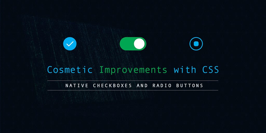
Hacking Custom Checkboxes And Radios
▻https://hackernoon.com/hacking-custom-checkboxes-and-radios-5d48230440d?source=rss----3a8144eab
Cosmetic improvements to checkboxes and radios using CSSRadios (or radio buttons) and checkboxes are very important input elements commonly found in so many forms on the web.Checkboxes are used where multiple values from a list of predefined values may apply — for example, marking multiple files for deletion from a list of files.Radio buttons on the other hand are used where only one value is applicable — for example, selecting gender from a list.In this tutorial, we’ll examine using a step-by-step approach, how to improve the aesthetics and appearance of radios and checkboxes using #css while still preserving the accessibility of the input elements.In order to fully appreciate this tutorial, a basic understanding of CSS — selectors and style rules is required. However, you don’t really have to be (...)
#software-development #web-development #front-end-development #hackernoon-top-story

Why can’t I set the font size of a visited link?
Notice that the visited link appears gray, as expected, but the font size hasn’t changed! This is because changing the font size would be a security vulnerability! If CSS could set the font size differently, I (Jim) could tell whether you’ve visited pornhub.com. But how?
▻https://jameshfisher.com/2019/03/08/why-cant-i-set-the-font-size-of-a-visited-link
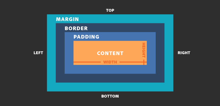
The Box Model
▻https://hackernoon.com/the-box-model-44fc2c04a935?source=rss----3a8144eabfe3---4
This article will brief you about the #css Box Model.What is The Box Model?Every element in the #html document comprised of one or more rectangular boxes. CSS box model describes how these rectangular boxes are laid out on a web page. The Box Model describes how the padding, border, and margin are added to the content to create this rectangle. In other words, we can say that every box has a content area and an optional surrounding margin, padding, and border.by republic.comThe innermost rectangle is the content box. The width and height of this depend on the element’s content (text, images, videos and any child elements ).Then we have the padding box (defined by the padding property). If there is no padding width defined, the padding edge is equal to the content edge.Next, the border box (...)

Mettre en page un livre avec uniquement du #logiciel_libre (non, pas LaTeX), un cas réel raconté par le maquettiste/typographe ▻https://polylogue.org/addictions-sur-ordonnance-making-of-dune-collection-liberee #HTML #CSS #JavaScript #PDF #UI
#bem should not exist
▻https://hackernoon.com/bem-should-not-exist-6414005765d6?source=rss----3a8144eabfe3---4
There is a lot of reasons for not using this methodology, but because of its simplicity and misunderstanding of work of HTML and #css, this methodology has spread wildly among frontend developers around the world; in most cases among developers from CIS countries. BEM is used now in large Russian-language projects (Yandex, Habr) and in several frameworks (react-md). In this article, a detailed review of the pros and cons of this development approach will be conducted. All examples will be shown from the official BEM site.Acronym “BEM” — block/element/modifier. Every design or layout can be visually parted on blocks, for example — sidebar. Each block can contain one or several elements. Elements can have modifiers of states (active, disabled),additional classes for changes of borders, width, (...)


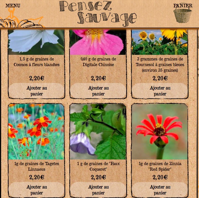
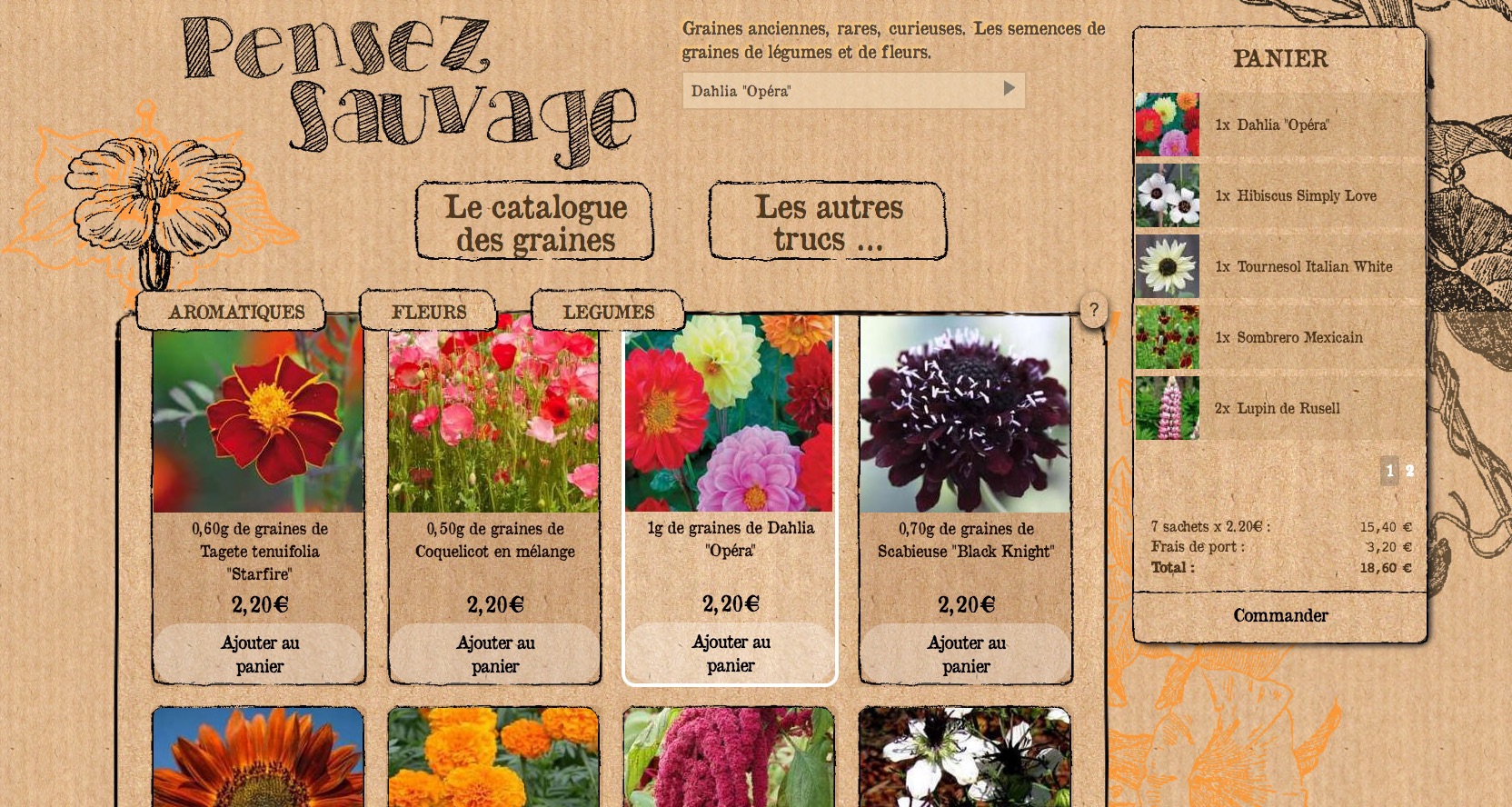
Lancement aujourd’hui de la nouvelle refonte du site #SPIP de ►http://pensezsauvage.org #shameless_autopromo donc
Depuis quelques années, l’association pensezsauvage fait pousser des plantes potagères, des fleurs curieuses et rares pour récolter les graines à redistribuer et à revendre sur les marchés ou sur internet.
Jusque là, le site disposait du theme_greeny de @marcimat (merci :*) avec un squelette légèrement modifié. Mais l’asso souhaitait quelque chose de plus clair et de responsive, avec une navigation compréhensible à tout·es. C’est finalement Mikou de pensez sauvage lui même qui a dessiné la maquette style Kraft. Pas évident du tout, mais j’estime que c’est bien la technique qui doit se plier aux idées créatives et non l’inverse. J’ai refait l’architecture du site et réalisé les fonctionnalités et l’intégration SPIP html/css/js sur une base zcore. J’ai créé une boutique minimaliste avec trois plugins SPIP : prix, panier et paypal, il n’y a ni compte client ni stockage de coordonnées, bref, rien d’autre qu’un document de l’article avec un champ ’prix’ à remplir.
L’idée est celle d’un onepage où l’internaute navigue par ancres, un petit JS perso permet de tester si l’ancre existe, sinon de renvoyer vers l’URL demandée pour éviter les impasses de navigation et permettre au site d’évoluer à son rythme. Bon, j’avoue que j’étais pas réjouit de mettre tout le catalogue sur l’accueil, mais j’ai trouvé des astuces pour alléger.
Il m’aurait été parfaitement impossible de faire cela sans #CSS3 il n’y a que serait-ce 5 ans et je me suis pas mal amusée à vrai dire.
Le plugin panier a été modifié pour faire apparaitre les sachets de graines au fur et à mesure de leur mise au panier, avec un peu d’ajax perso on reste sur la même page le plus souvent possible. Le plugin lazysizes permet de ne faire apparaitre les images au format définitif que lorsque la vue visiteur est en face.
Comme l’asso et les visiteurs préfèrent de loin les chèques, qui évitent de laisser des données sur internet, le panier une fois remplit peut être imprimé avec un montant qui déduit les frais de paypal.
Pour cela j’ai créé une page reprise par le plugin Dompdf qui créé le pdf du panier de session du visiteur à la volée.
La recherche est en autocompletion sur l’ensemble du catalogue des graines, la page glisse ensuite vers le sachet choisi.
Merci à @jacotte qui a bien voulu revoir de ses yeux de lynx les défauts restants à corriger. Par exemple la font choisie par Mikou ne disposait pas d’apostrophes et de virgules correctes. Je suis donc passée par FontForge pour corriger cela avant l’intégration en base64 dans la CSS.
Merci aussi à @james qui m’a poussé à écrire ce billet !

C’est très très chouette.
Par contre je trouve pas très pratique ce gros header fixe qui me prend un bon tiers de l’écran [edit]si > 1600px de large[/edit] et du coup limite le contenu du catalogue sous les yeux à 1 ligne, assez bas, comme on le voit sur ta dernière capture justement.

@marcimat merci de tes retours
effectivement, je préfère aussi le mode <1600px
je vais peut-être tenter de « dézoomer » la page quand on est >1600px
Et pour « Les autres trucs » c’est tout bêtement les articles en pied de page ! mais c’est pas bien clair, je vais remettre ce titre pour mieux comprendre :)


Paged.js – Paged Media
▻https://www.pagedmedia.org/paged-js
aged.js is an open-source library to paginate content in the browser. Based on the W3C specifications, it’s a sort of polyfill for Paged Media and Generated Content for Paged Media CSS modules. The development was launch as an open-source community driven initiative of it’s still experimental. The core team behind paged.js includes Adam Hyde, Julie Blanc, Fred Chasen & Julien Taquet.

Très intéressant, nous qui essayons de rédiger et générer nos documents papiers longs (cahier des charges, documentation finale, etc) depuis SPIP… Enfin « essayons », non, on y arrive assez bien maintenant, mais toujours avec PrinceXML qui n’est pas libre. Et on reteste Weasy (libre python) régulièrement car il évolue bien.
►https://seenthis.net/messages/734575
À suivre de prêt, cette initiative…
« Supported by Shuttleworth fundation »

Le site est deprecated et maintenant il faut aller sur :
▻https://www.pagedjs.org
One line of code to remove :focus blue outline and keep #accessibility
▻https://hackernoon.com/one-line-of-code-to-remove-focus-blue-outline-and-keep-accessibility-bca
One line of code to remove :focus blue outline and maintain accessibilityEveryone encounters this problem every time they make a web page with a button… The odd and out of place blue outline around a button after it is clicked [see below]After clicking a button, the blue outline appears to indicate that it is in focus.One approach is to remove the outline with css:▻https://medium.com/media/69122725b2413cca675d3af9f32bcf18/hrefThe purpose of the outline is to improve website accessibility to those with disabilities or those who are navigating with only a keyboard, so we cannot just get rid of it altogether. We want to remove the outline only after the button is pressed.If you look around online, there are many overly complicated solutions that detect if the button is highlighted from a click (...)
20 Best Free HTML5, #css3, Bootstrap Landing Page Templates in 2018
▻https://hackernoon.com/20-best-free-html5-css3-bootstrap-landing-page-templates-in-2018-717488c
Website template is the best solution for site building. Here are 20 Best Free Bootstrap landing page templates in 2018 for creative and powerful website building.Your landing page is fundamental in persuading new visitors to take certain actions when visiting your site. Whether it be having users sign up, register, or even buy your product or service, designing an excellent landing page will help you realise this goal.But how do you quickly build a quality landing page? Using a powerful and flexible landing page template may be your best choice. Most HTML5, Bootstrap, and CSS3 templates include features that can help you effortlessly create a page. In addition, web designers and developers readily share free responsive landing page templates on the Internet for you to use. Mockplus (...)
Good analysis of a Web problem. Lesson: stop listening to Web designers. Do stuff that works, not impressive stuff that the designer likes.
Ce n’est pas la leçon qu’il en tire lui, et surtout même pas l’analyse qu’il en donne. Puisque ce qu’il dit c’est que le développeur qui a implémenté ça a fait n’importe quoi et n’a pas réfléchi qu’il pouvait y avoir une coupure en cours de route. Et il donne même clairement un autre exemple parfaitement similaire n’ayant rien à voir avec le design, avec un test A/B construit sur le même mauvais principe (de dev).
#mauvaise_foi :)
CSSDesk - bLNWs
▻http://www.cssdesk.com/bLNWs
Une solution possible pour le problème CSS de l’image flottante en bas à droite dans un bloc de texte
3 lignes de code pour convertir une #police_de_caracteres en base64 pour un fichier #css
Dans le terminal
base64 name-of-thefont-file-name.woff2 > base64encoded.txt
CSS
@font-face {font-family: “name-of-thefont”; src:url(data:font/woff;charset=utf-8;base64,font-file-in-encoded-form) format(’woff2’); font-weight: normal; font-style: normal; }
.madiv{
font-family:name-of-thefont;
}
#font
Ne pas oublier dans le @font-face font-display : auto pour avoir une police par defaut avant que la votre soit chargée.
font-family: 'tocfont';

font-display: auto;

src: local('tocfont'), url(data:font/woff;charset=utf-8;base64,d09GRgABAAAAAK…etc)) format('woff');
auto
auto uses whatever font display strategy the user-agent uses. Most browsers currently have a default strategy similar to block.
J’ai également optimisé le poids de ma font avant de la passer en base64, en utilisant le super #FontForge qui m’a permis de refondre la virgule et autres scories qui ne convenaient pas.

@seenthis si je tape seulement url suivi de parenthèses url(https://seenthis.net/) ça me colle seenthis dedans !
#seenthisbug
Read it when someone looks down at your Web site, saying “you should pay a designer”:
“A website’s materials aren’t #HTML tags, #CSS, or #JavaScript code. Rather, they are its content and the context in which it’s consumed”
And
“By default, a website that uses HTML as intended and has no custom styling will be readable on all screens and devices. Only the act of design can make the content less readable” (for those who keep repeating “responsive” without understanding it)
Home Page - WeasyPrint
►https://weasyprint.org
Un logiciel serveur pour générer les PDF à partir de pages HTML + CSS (nécessite python 3.8)
Dépot github : ▻https://github.com/Kozea/WeasyPrint
La revue de Linuxfr.org : ▻https://seenthis.net/messages/734549
(on va tester pour faire des retours d’usages...)

On a testé de manière assez poussé en comparaison avec Prince. En testant plein de trucs sur les pages, les trucs à mettre dans les marges, le CSS3…
Weasy est libre et bouge régulièrement alors ça se trouve il y a eu des ajouts depuis il y a quelques mois, mais ça ne gère vraiment pas autant que Prince, notamment en CSS3.
Mais quand on a une maquette graphique pas trop complexe, ça marche parfaitement très bien, et du coup ça permet de générer tout en libre, et donc possiblement côté serveur aussi.
On imaginait peut-être un plugin SPIP qui appellerait une génération sur le serveur… (mais encore une fois, ça dépend de la maquette).
#intégration #CSS #HTML #print #impression
Une initiative en lien, à suivre :
►https://seenthis.net/messages/742687
CSS Grid in IE : CSS Grid and the New Autoprefixer | CSS-Tricks
▻https://css-tricks.com/css-grid-in-ie-css-grid-and-the-new-autoprefixer
Utilisation des propriétés CSS3 grid avec Internet Explorer : les adaptations/contournements apportés par Autoprefixer et les propriétés vraiment pas supportées.
Voir aussi :
– le repo d’autoprefixer ▻https://github.com/postcss/autoprefixer (Gulp / Grunt / js autonome...)
– le repo de html-autoprefixer pour les CSS inline : ▻https://github.com/RebelMail/html-autoprefixer
CSS Layout cookbook - CSS: Cascading Style Sheets (▻https://develope...
▻https://diasp.eu/p/7852931
CSS Layout cookbook - CSS: Cascading Style Sheets | #cookbook #CSS #MDN #layout